3 simple steps to add dark mode support to your DEV static blog generated via Stackbit
projectbenatar webdev css html
As most of you probably know, DEV has teamed up with Stackbit and now we can all generate and maintain our own statically-hosted blog that pulls our DEV posts automatically.
If you missed the announcement, you can check it out here
As soon as I finished reading that article, I thought: "I need to have my site right now" 😆
I followed the instructions and, in a couple of minutes (and without pain) my site was alive 🎉
The only thing was that I'm obsessed with dark mode and the templates available right now doesn't support it, so I was being blinded by my own site ☀️, so I decided to change some styles to fix it.
Clone your github repo
After following the instructions described here, you'll have a new repo generated on your github account. To start working, clone it to your local computer.
1 - Let's work on our dark.css file
- For Jekyll, go to assets/css
- For Hugo, go to assets/
- For Gatsby, go to static/assets/css
Then, create a new css file called "dark.css" and paste the following code:
@media (prefers-color-scheme: dark) {
	/* In dark themes, elevated surfaces and components are colored using overlays.
	The higher a surface’s elevation, the lighter that surface becomes.*/
    .site-header.dark, .site-nav-wrap {
		background: hsl(0, 0%, 7%);
	}
	body {
        background: hsl(0, 0%, 10%);
	}
	.site-header.dark .site-navigation, .site-nav-wrap {
		background: none;
	}
	/* High-emphasis text should have an opacity of 87% */
	h1, h2, h3, h4, h5, h6, .block-title, .site-header.dark, .site-nav-wrap {
		color: hsla(0, 100%, 100%, 0.87);
	}
	/* Medium emphasis text is applied at 60% */
	body, label, a.button:hover, button:hover, pre:before, pre, blockquote {
		color: hsla(0, 100%, 100%, 0.60);
	}
	/* Links uses an opacity of 38%. */
	a, a.read-more-link {
		color: hsla(0, 100%, 100%, 0.38);
	}
	pre:before {
		border-color: hsl(0, 0%, 25%);
	}
	pre, .post-feed .post-inside {
		border: none;
		border-radius: unset;
		background: hsl(0, 0%, 14%);
	}
	pre {
		/* Change this color if you don't use violet as accent-color */
		border-left: #9371e6 0.4rem solid;
	}
	.post-feed .post-thumbnail img {
		border-radius: unset;
	}
	blockquote {
		font-size: 1rem;
		margin: 1.5rem 0;
		border-top: none;
		border-bottom: none;
		/* Change this color if you don't use violet as accent-color */
		border-left: #9371e6 0.4rem solid;
		padding: 1rem;
	}
	label {
		font-weight: normal;
	}
	input[type="text"],
	input[type="password"],
	input[type="email"],
	input[type="tel"],
	input[type="search"],
	input[type="url"],
	select,
	textarea {
		background: hsl(0, 0%, 14%);
		border: none;
		color: hsla(0, 100%, 100%, 0.60);
	}
}
The prefers-color-scheme CSS media feature is used to detect if the user has requested the system use a light or dark color theme.
If you want to keep your site on dark mode (overriding the user preference), just remove the @media (prefers-color-scheme: dark) {} in your dark.css file
2 - Add the link tag for dark.css
- For Jekyll, you should add the link tag in the _layouts/base.html file.
- For Hugo, add it in the layouts/_default/baseof.html file.
- For Gatsby, add it in the src/components/Layout.js file.
The link tag for your new dark.css file should be located below the main.css link tag.
3 - Update your accent color (Optional)
I used the violet palette for my dark mode setup. If you want to update the accent color:
- For Hugo and Jekyll - Update the config.yml file and set the palette to violet.
- For Gatsby - Update the site-metadata.json file and set: "palette": "violet"
After pushing your changes, Netlify will update your site with the new dark mode working
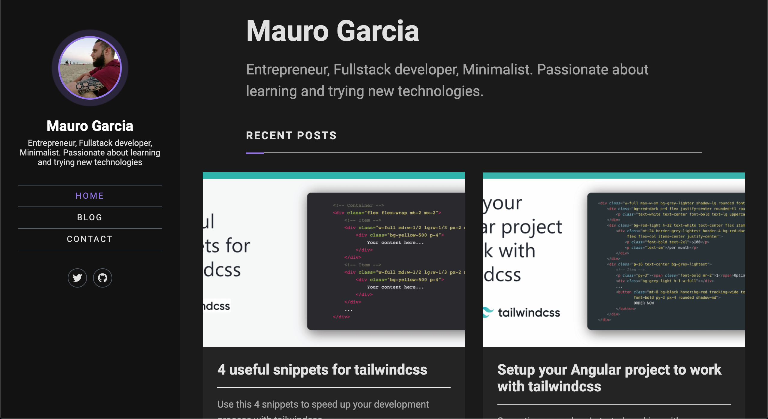
My site before:
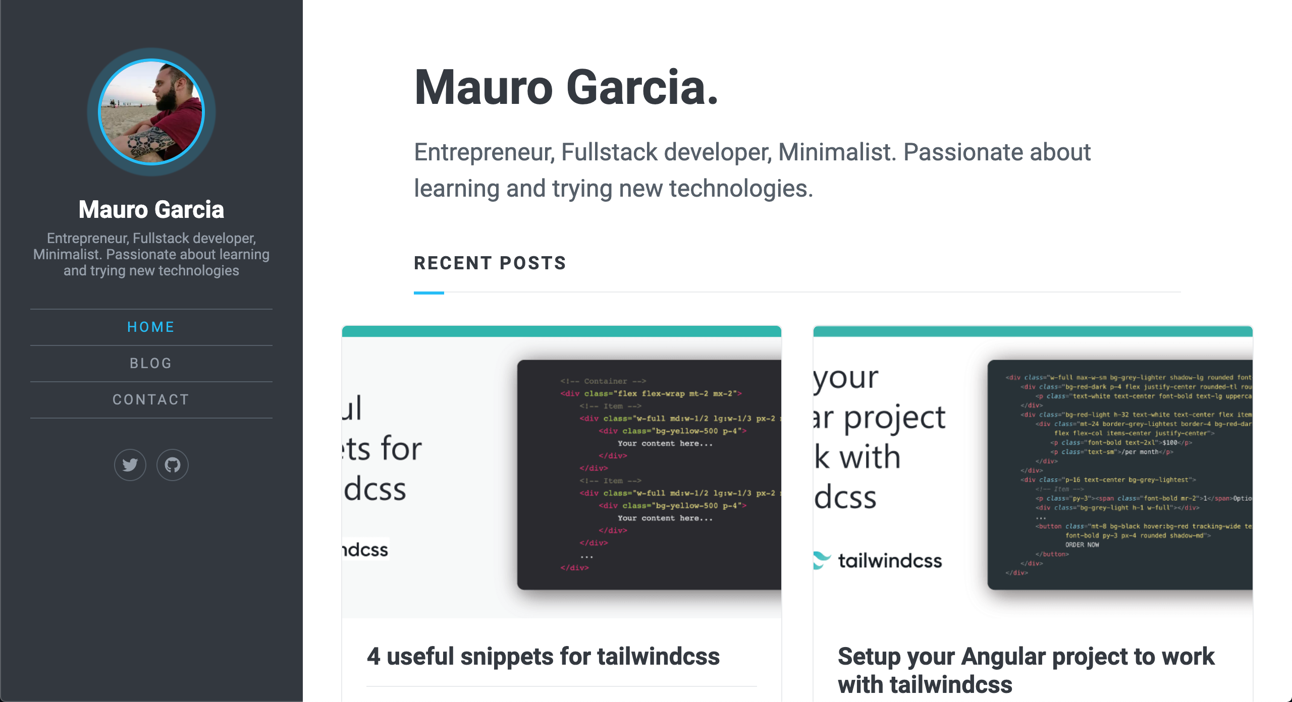

My site now 😎: