
3 Reusable components with Angular and tailwindcss
angular javascript tailwindcss ui
In a previous post, I wrote about 4 useful snippets for tailwindcss.
As I mentioned on that article, when you're working with tailwindcss you will find certain scenarios where you could think "Too much duplicated code". But if you are working with any modern JS framework like Angular, you will drastically reduce this duplication by extracting reusable components.
So I thought it could be useful to show you how to do this using the same tailwindcss snippets from my past article.
1- Colorful notes

This component is super simple and will allow us to customize both color and content
// colorful-note.component.ts
@Component({
	selector: 'colorful-note',
	templateUrl: './colorful-note.component.html',
	styleUrls: ['./colorful-note.component.css']
})
export class ColorfulNoteComponent implements OnInit {

	@Input() color: string = "teal"
	@Input() title: string
	@Input() description: string

	constructor() { }

	ngOnInit() {
	}

}
<!-- colorful-note.component.html -->
<div class="bg-{{color}}-100 text-{{color}}-500 border-l-8 border-{{color}}-500 p-4 mb-2">
<p class="font-bold">{{title}}</p>
<p>{{description}}</p>
</div>Usage
<colorful-note color="red" title="Note" description="Lorem ipsum dolor sit amet..."></colorful-note>
<colorful-note color="blue" title="Note" description="Lorem ipsum dolor sit amet..."></colorful-note>
<colorful-note color="green" title="Note" description="Lorem ipsum dolor sit amet..."></colorful-note>
<colorful-note color="yellow" title="Note" description="Lorem ipsum dolor sit amet..."></colorful-note>
2- Three columns card grid
For this component, I'm gonna use the Smart/Dumb pattern. If you don't know this pattern, please checkout this article.
TL;DR
- Dumb component: It is a component that for received data (inputs), will always look and behave the same, possibly also producing other data
- Smart components: It is not only dependant on its’ inputs, but also on some kind of external data (“the outer world”), which is not passed directly via @Input(). It might also produce some side effects that are not emitted through the @Output() interface
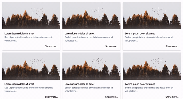
My smart component for this implementation will be called Grid component, and will we be used for:
- Retrieving a list of articles
- Displaying each article using the dumb component
Finally, my dumb component will be called Grid item component and will be used to render each article using the data received from the smart component.
What's really powerful about this dumb component is that it's super generic, so you'll be able to use it in other scenarios.
Grid component (Smart):
// Class used to transfer data between components
export class Article {
    title: string;
    description: string;
    imgUrl: string;
    link: string;
}

// grid.component.ts
@Component({
    selector: 'grid',
    templateUrl: './grid.component.html',
    styleUrls: ['./grid.component.css']
})
export class GridComponent implements OnInit {

    articles: Article[] = []

    constructor() { }

    ngOnInit() {
        this.getArticles()
    }

    getArticles() {
        // Get data and set articles...
    }
}
<!-- grid.component.html -->
<div class="flex flex-wrap mt-2 mx-2">
<!-- Items -->
<app-grid-item *ngFor="let article of articles"
[title]="article.title"
[description]="article.description"
[imgUrl]="article.imgUrl"
[link]="article.link"
class="w-full md:w-1/2 lg:w-1/3 px-2 my-2">
</app-grid-item>
</div>Grid item component (Dumb):
// grid-item.component.ts
@Component({
	selector: 'grid-item',
	templateUrl: './grid-item.component.html',
	styleUrls: ['./grid-item.component.css']
})
export class GridItemComponent implements OnInit {

	@Input() title: string
	@Input() description: string
	@Input() imgUrl: string
	@Input() link: string

	constructor() { }

	ngOnInit() {
	}

}
<!-- grid-item.component.html -->
<div class="shadow-md bg-white">
<img class="h-48 w-full object-cover" [src]="imgUrl" alt="">
<div class="flex flex-col p-4">
<p class="text-lg">{{title}}</p>
<p class="text-gray-600">{{description}}</p>
<a [href]="link" class="self-end mt-4">Show more...</a>
</div>
</div>Buttons

Another simple and practical example. We will use only one component to setup content, color and style for our buttons
// button.component.ts
@Component({
	selector: 'app-button',
	templateUrl: './button.component.html',
	styleUrls: ['./button.component.css']
})
export class ButtonComponent implements OnInit {

	@Input() type: string = 'simple'
	@Input() color: string = 'teal'
	@Input() text: string
	constructor() { }

	ngOnInit() {
	}

	getStyles() {
		switch(this.type) {
			case 'simple':
				return `bg-${this.color}-500 hover:bg-${this.color}-700 text-white font-bold py-2 px-4 rounded mb-2 border border-${this.color} mx-2`
			case 'outline':
				return `hover:bg-${this.color}-500 text-${this.color}-700 font-semibold hover:text-white py-2 px-4 border border-${this.color}-500 hover:border-transparent rounded mb-2 mx-2`
		}
	}

}
<!-- button.component.html -->
<button [class]="getStyles()">{{text}}</button>Usage
<app-button text="Simple teal button"></app-button>
<app-button text="Outline teal button" type="outline"></app-button>
<app-button text="Simple red button" color="red"></app-button>
<app-button text="Outline red button" type="outline" color="red"></app-button>
<app-button text="Simple indigo button" color="indigo"></app-button>
<app-button text="Outline indigo button" type="outline" color="indigo"></app-button>
If you want to checkout the code, here is my github repo